When Trust Needs a Visual Voice: The Everyday Power of Verification Icons
We live in a world where a single glance decides trust. On a crowded app store, a chaotic social feed, or a bustling e‑commerce checkout, people make snap judgments. One of the quietest yet most decisive elements in that split‑second evaluation is a tiny, familiar shape—a checkmark, a shield, a star, or a badge. What many call verification icons do more than decorate a screen. They whisper, “This is legitimate. This is safe. This is worth your next tap.”
Designers sometimes reduce icons to an afterthought, a final sprinkle of polish. But the ones that signal authenticity, completion, or certification carry weight that outpaces their size. A poorly crafted verification icon doesn’t just fade into the background; it can subtly erode confidence. A pixel‑perfect, versatile set, on the other hand, elevates everything from a freelance portfolio to a high‑traffic fintech dashboard.
The real value isn’t in having “an icon.” It’s in having a system of icons that adapts so naturally that no user has to think about them. That’s where thoughtful icon design stops being about decoration and starts becoming part of the user experience architecture.
Projects Survive on Clarity, Not Complexity
Imagine you’re building a mobile health app that helps people track their symptoms before a telemedicine visit. A user enters their blood pressure reading and taps “Submit.” The screen refreshes, and they need to know instantly whether the data landed securely. A green checkmark appears, clean and crisp at 48 pixels. That’s a verification moment. But suppose that same icon must also live on a printed summary PDF, a promotional flyer for a clinic, and an onboarding poster in a waiting room. Suddenly, a single‑style icon isn’t enough.
Minimalist icon design becomes a practical necessity here, not an aesthetic preference. When verification icons come in both line and solid styles, the same core visual language translates across radically different surfaces. A doctor’s tablet might show a solid‑style shield for “certified safe,” while an email newsletter uses a line‑style badge to preserve white space and keep the layout breathable. The meaning survives because the visual DNA is consistent.
Real‑world situations where this matters:
- Social media infographics for mental health advocates: A verified fact stamp signals that a statistic has been reviewed by a clinician—no one questions the icon’s intent.
- SaaS onboarding flows: Progressive completion checkmarks guide users without adding cognitive noise.
- Event banners and posters: Large‑scale verified speaker badges or sponsor logos remain legible at 512px when the source file supports clean scaling.
- E‑commerce reward tiers: A hollow line icon for “member,” a solid one for “VIP,” instantly communicable without a tutorial.
Different Industries, Different Silent Promises
An education platform uses verification icons to mark which courses offer accredited certificates. A food delivery app uses them to confirm a restaurant has passed health inspections. A dating app uses them to indicate photo‑verified profiles. None of these companies explain the icons with text. They don’t need to. But the visual execution has to be flawless, because trust is at stake.
Consider what happens inside a fintech product. A user uploading a government ID for KYC compliance stares at a loading spinner, then sees a shield icon resolve into a crisp, editable‑stroke checkmark. That moment matters. If the icon renders blurry at 64px on a high‑DPI Android device or breaks when recolored to match a dark‑mode interface, the psychological anchor weakens. The user might hesitate, contact support, or worse, abandon the process.
Editable stroke icons address this directly. They let teams match an icon’s weight to their brand’s typographic rhythm. A bank might need a bolder stroke for accessibility compliance; a minimalist lifestyle app might prefer a delicate 1px line. When you can customize the stroke width without distorting the shape, you’re not just placing an icon—you’re integrating a trust signal into a living design system.
The Quiet Flexibility That Keeps Workflows Sane
Design teams rarely start from scratch anymore. They pull up a component library in Figma, grab icons from a shared Iconjar file, or sync assets through a Sketch library. The difference between a smooth afternoon and a frustrating one often comes down to how icons arrive. High‑quality icon sets that offer drag‑and‑drop ease aren’t a luxury; they’re a sanity saver.
Picture a freelance brand designer juggling three client projects. One client demands source files in Adobe Illustrator for a print brochure. Another needs a Figma file for an app prototype by Thursday. A third wants a simple set of 96px PNGs for a social media campaign—but they need transparent backgrounds to overlay on photos. Without a kit that covers EPS, SVG, PDF, and multiple PNG sizes, that designer spends hours exporting, resizing, and praying nothing breaks during scaling.
When verification icons come packaged at 32px, 48px, 64px, 96px, 128px, 256px, and 512px as transparent PNGs, the thinking shifts from “how do I make this work” to “where will this be most effective.” That mental shift is where creative strategy actually lives. The 32px version slides into a price comparison table seamlessly. The 512px version anchors a homepage hero banner without pixelation. The SVG version gets dropped into a React component and themable with a single fill attribute.
When Minimalism Becomes a Functional Strategy
Minimalist icon design isn’t simply “less detail.” It’s about making the meaning louder than the shape. A verification checkmark with unnecessary frills—a shadow, a gradient, a decorative circle—starts competing with the message. In a form validation context, users shouldn’t admire the icon; they should absorb the feedback and move on.
Yet minimalism doesn’t mean fragile. Icons need to survive at tiny sizes in footnotes and stay visually balanced when blown up on a billboard. Editable stroke icons allow that because the core structure remains geometrically sound. Adjust the stroke thickness for environmental use without redrawing the icon. That simple capability opens up use cases that rigid, pre‑baked icons can’t touch.
Scenarios where this flexibility unlocks real value:
- A nonprofit builds an advocacy poster with verified impact statistics—the icons must print crisp at 300dpi on a banner.
- A developer integrates a verification badge into a notification toast—the 32px PNG must look sharp on a Retina display.
- A content creator overlays a verified source marker onto video thumbnails—the SVG must scale without aliasing artifacts.
- A UX researcher prototypes a trust‑badge variant test—Figma components with nested, recolored icons accelerate the experiment.
Navigating Common Decisions Before You Choose a Set
Before committing any icon pack to a project, pragmatic questions arise. Is the stroke fully editable, or just style‑locked? Does the license allow use in print, digital, and branded merchandise without multiple tiers? Are the source files named intuitively, or will someone waste 20 minutes hunting for a simple checkmark? A Readme.txt file might seem trivial, but the best sets use it to clarify structure, license terms, and quick‑start tips—saving the quiet frustration of trial‑and‑error imports.
File compatibility also deserves a moment of honest attention. An icon set that includes Figma, Sketch, and Iconjar files signals that it was built by people who understand real‑world workflows. A single Illustrator file alone forces extra conversion steps for UI designers who live in Figma. An EPS version 10, while vintage‑compatible, still serves print‑focused teams who rely on older prepress pipelines. Having PDF and SVG on hand means the icons aren’t just “digital assets”; they’re fit‑for‑purpose across media boundaries.
And let’s talk about the tension between high‑quality and 100% customizable. High‑quality implies that icons are crafted with consistent optical weight, proper alignment to pixel grids, and sensible anchor points. Customizable implies that none of that quality breaks when you tweak a color or adjust a stroke. The best sets hold both promises without compromise, because the foundational vector structure is clean and the files are layered or styled thoughtfully.
Beyond the Badge: A System That Grows With You
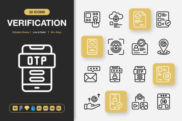
The mistake many make is treating verification icons as static assets rather than a living system. A startup might launch with five badges and, two years later, need verification tiers for identity, payment method, and credentials. If the original icon set doesn’t provide a coherent visual family to expand upon, the experience splinters. A consistent set of line and solid icons, with editable strokes and varied symbolic forms—checks, shields, stars, locks, ribbons—gives a brand room to evolve without visual drift.
Financial planning apps, for instance, might start by verifying a linked bank account. Next, they verify identity documents. Later, they verify investment accreditation status. Each escalation deserves a distinct icon that nevertheless reads as part of the same trust architecture. Users subconsciously recognize the consistent stroke style and geometric simplicity. They may never articulate it. They’ll just feel like the app is coherent, built by people who cared enough to sweat the details.
The Smallest Bit of UI With the Largest Ripple
People don’t gush over icon design. They won’t tweet, “Wow, the stroke weight on this checkmark is perfectly balanced.” But they will hesitate on a payment page that feels visually off. They’ll close a sign‑up form when the “verified” badge looks like a placeholder. And they’ll trust a medical portal that feels polished and considered, without ever analyzing why.
That’s the quiet ripple of well‑designed icons. A set built for drag‑and‑drop ease, ready for Illustrator deep dives, Figma component libraries, Sketch symbol overrides, and scalable PNG exports, dissolves the friction between meaning and execution. It lets the icon do what it’s meant to do: build a bridge of trust in the moment between seeing and believing. And when that moment works, the rest of the experience has a better chance to follow.